Technical indicators are tools used in financial trading to analyze price and volume data of financial assets, such as stocks, currencies, commodities, and more. These indicators are mathematical calculations that can guide traders to make informed decisions about buying or selling assets based on historical price patterns and trends. There are different types of indicators, such as trend indicators, momentum indicators, and volatility indicators, that I will explain in detail below.
Trend Indicators
Trend indicators serve as invaluable guides in the world of finance, much like a sophisticated GPS system for traders. They are essential tools for measuring both the direction and the strength of the prevailing market trend, allowing investors to discern whether the market is ascending, descending, or moving laterally. Two prominent trend indicators that deserve special mention are the “Simple Moving Average (SMA)” and the “Average Directional Movement Index (ADX).” These indicators provide a robust analytical framework for market participants seeking to make informed decisions.
Trend Indicator #1: Simple Moving Average (SMA)
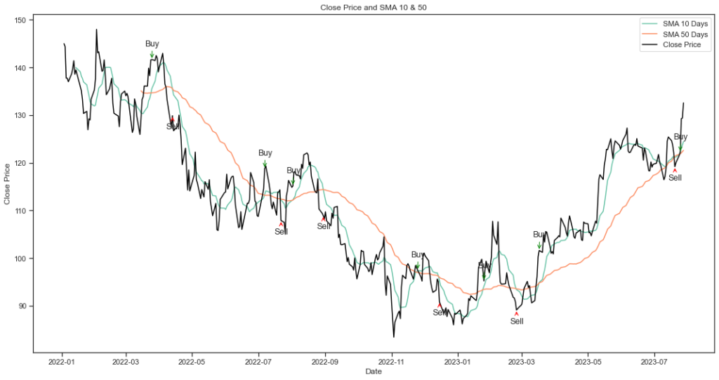
The Simple Moving Average (SMA) is a fundamental tool in technical analysis used to assess the historical price behavior of a stock. It calculates the average price of a security over a specified time period, creating a smoothed line that helps traders and investors identify trends and potential reversal points.
Here’s how SMA can be used in the technical analysis of a stock:
- Trend Identification: One of the primary uses of the SMA is to identify the prevailing trend in a stock’s price movement. When the stock price is above the SMA, it suggests an uptrend, and when it’s below, it indicates a downtrend.
- Support and Resistance Levels: When the stock price approaches or touches the SMA, it may experience a bounce (if it’s a support level) or face resistance (if it’s acting as a resistance level). These levels can help traders make decisions about buying or selling.
- Crossovers: The crossover strategy involves two SMAs with different timeframes, such as a short-term (e.g., 10-day) and a long-term (e.g., 50-day) SMA. A bullish signal occurs when the short-term SMA crosses above the long-term SMA, suggesting a potential upward trend.
Here’s a Python example demonstrating how to retrieve the stock price of Google, along with its 10-day and 50-day moving averages.
# Import Libraries
import pandas as pd
import bt
import talib
import matplotlib.pyplot as plt
import yfinance as yf

############################################
# STEP 1: IMPORTING DATA & DATA FORMATTING
############################################

# Define the ticker symbol for Google (GOOGL)
ticker_symbol = 'GOOGL'

# Create a yfinance ticker object for the specified stock
stock = yf.Ticker(ticker_symbol)

# Fetch historical data for the stock
data = stock.history(start='2022-1-1',end='2023-7-31')

# Reset index
data = data.reset_index()

# Convert to Datetime format
data['Date'] = pd.to_datetime(data['Date'])

############################################
# STEP 2: SIMPLE MOVING AVERAGE
############################################

# SMA: 10 Days
data['SMA_10'] = talib.SMA(data['Close'],timeperiod=10)

# SMA: 50 Days
data['SMA_50'] = talib.SMA(data['Close'],timeperiod=50)

############################################
# STEP 3: PLOTTING DATA
############################################

# Change the size of the chart
plt.figure(figsize=(15, 8))

# Plotting the SMA
plt.plot(data['Date'],data['SMA_10'],label = 'SMA 10 Days')
plt.plot(data['Date'],data['SMA_50'],label = 'SMA 50 Days')
plt.plot(data['Date'],data['Close'],label = 'Close Price', color='black')

# Add annotations for buy and sell signals
annotation_fontsize = 12.5

for i in range(1, len(data)):
    if data['SMA_10'][i] > data['SMA_50'][i] and data['SMA_10'][i - 1] <= data['SMA_50'][i - 1]:
        plt.annotate('Buy', (data['Date'][i], data['Close'][i]), xytext=(-10, 20), textcoords='offset points', arrowprops=dict(arrowstyle='->', color='green'), fontsize=annotation_fontsize)
    elif data['SMA_10'][i] < data['SMA_50'][i] and data['SMA_10'][i - 1] >= data['SMA_50'][i - 1]:
        plt.annotate('Sell', (data['Date'][i], data['Close'][i]), xytext=(-10, -20), textcoords='offset points', arrowprops=dict(arrowstyle='->', color='red'), fontsize=annotation_fontsize)

# Customize and show the plot
plt.legend()
plt.title('Close Price and SMA 10 & 50')
plt.ylabel('Close Price')
plt.xlabel('Date')
plt.tight_layout()
plt.show()
Trend Indicator #2: Average Directional Movement Index (ADX)
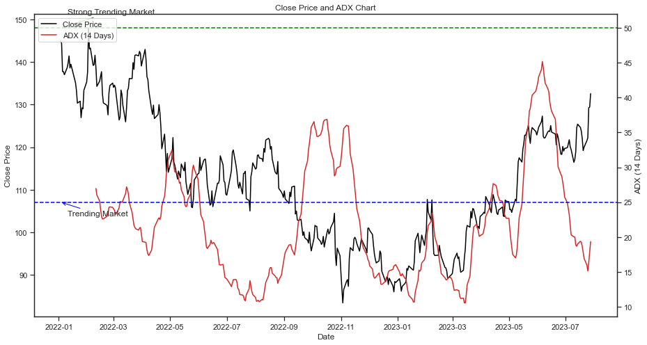
The Average Directional Movement Index (ADX) is a technical indicator to assess the strength and direction of a trend. Developed by J. Welles Wilder, it helps traders and investors make informed decisions about whether to buy, sell, or hold a stock. Here’s how the ADX can be used in the technical analysis of a stock:
- Trend Strength Measurement: It provides a numeric value between 0 and 100. A higher ADX value suggests a stronger trend, whether it’s an uptrend or a downstream. Traders often use a threshold, such as the following:
- ADX ≤ 25: No trend
- ADX > 25: Trending market
- ADX > 50: Strong trending market
- Risk Management: Traders often use the ADX to manage risk. For instance, they might choose not to enter a trade or to tighten stop-loss orders when the ADX indicates a weak or indecisive trend.
Here’s a Python example demonstrating how to retrieve the stock price of Google, along with its ADX.
# Import Libraries
import pandas as pd
import bt
import talib
import matplotlib.pyplot as plt
import yfinance as yf

############################################
# STEP 1: IMPORTING DATA & DATA FORMATTING
############################################

# Define the ticker symbol for Google (GOOGL)
ticker_symbol = 'GOOGL'

# Create a yfinance ticker object for the specified stock
stock = yf.Ticker(ticker_symbol)

# Fetch historical data for the stock
data = stock.history(start='2022-1-1',end='2023-7-31')

# Reset index
data = data.reset_index()

# Convert to Datetime format
data['Date'] = pd.to_datetime(data['Date'])

############################################
# STEP 2: CALCULATE ADX
############################################

# Calculate the ADX with the default time period
data['ADX_14'] = talib.ADX(data['High'],
                            data['Low'],
                            data['Close'],
                            timeperiod=14)


############################################
# STEP 3: PLOTTING ADX
############################################

# Create a figure and two subplots
fig, ax1 = plt.subplots()

# Change the size of the chart
fig.set_size_inches(15, 8)

# Plot Close Price on the left y-axis
ax1.plot(data['Date'], data['Close'], color='black', label='Close Price')
ax1.set_xlabel('Date')
ax1.set_ylabel('Close Price')
ax1.tick_params(axis='y')

# Create a second y-axis for ADX on the right
ax2 = ax1.twinx()

# Plot ADX values on the right y-axis
ax2.plot(data['Date'], data['ADX_14'], color='tab:red', label='ADX (14 Days)')
ax2.set_ylabel('ADX (14 Days)')
ax2.tick_params(axis='y')

# Add horizontal lines and annotations for ADX levels
ax2.axhline(25, color='blue', linestyle='--')
ax2.annotate('Trending Market', (data['Date'].iloc[0], 25), xytext=(10, -20), textcoords='offset points', arrowprops=dict(arrowstyle='->', color='blue'))

ax2.axhline(50, color='green', linestyle='--')
ax2.annotate('Strong Trending Market', (data['Date'].iloc[0], 50), xytext=(10, 20), textcoords='offset points', arrowprops=dict(arrowstyle='->', color='green'))

# Add a legend
lines1, labels1 = ax1.get_legend_handles_labels()
lines2, labels2 = ax2.get_legend_handles_labels()
ax2.legend(lines1 + lines2, labels1 + labels2, loc='upper left')

# Display the plot
plt.title('Close Price and ADX Chart')
plt.show()
Momentum Indicators
Momentum indicators are tools used by traders and investors to evaluate the strength and speed of price movements in financial markets. These indicators help identify potential trend reversals, overbought or oversold conditions, and potential trading opportunities. These indicators are primarily concerned with the rate of change in price rather than the price levels themselves. One of the most popular momentum indicators is the “Relative Strength Index (RSI)”.
Momentum Indicator #1: Relative Strength Index (RSI)
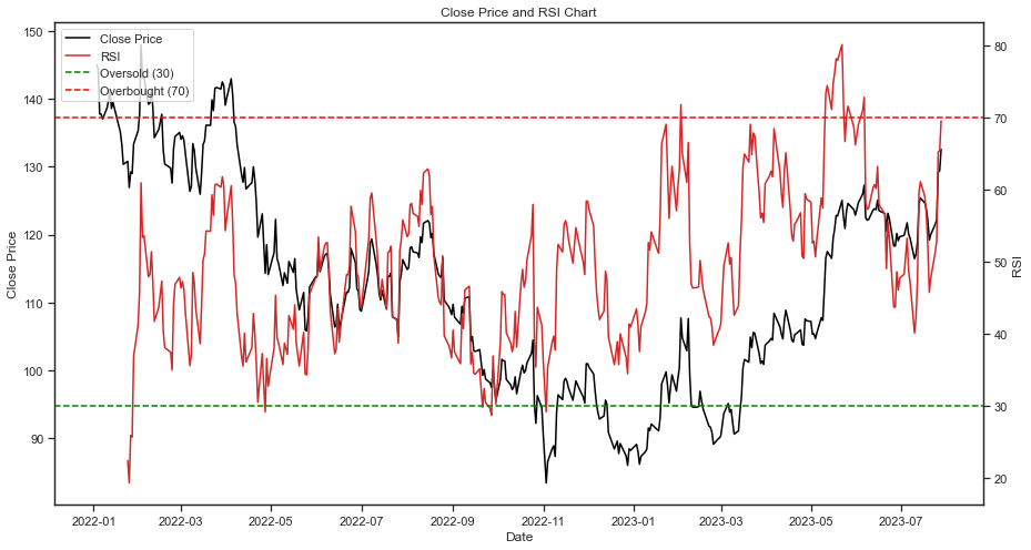
The Relative Strength Index (RSI) is a tool used to measure the magnitude of recent price changes to evaluate overbought or oversold conditions and helps traders and investors make informed decisions. Here’s how the RSI can be used in technical analysis:
- Overbought and Oversold Conditions: The RSI provides values ranging from 0 to 100. Traditionally, an RSI above 70 is considered overbought, while an RSI below 30 is considered oversold. Therefore, when RSI crosses above 70, it may generate a sell signal, while when it crosses 30 it may generate a buy signal.
Here’s a Python example demonstrating how to retrieve the stock price of Google, along with its RSI.
# Import Libraries
import pandas as pd
import bt
import talib
import matplotlib.pyplot as plt
import yfinance as yf


############################################
# STEP 1: IMPORTING DATA & DATA FORMATTING
############################################

# Define the ticker symbol for Google (GOOGL)
ticker_symbol = 'GOOGL'

# Create a yfinance ticker object for the specified stock
stock = yf.Ticker(ticker_symbol)

# Fetch historical data for the stock
data = stock.history(start='2022-1-1',end='2023-7-31')

# Reset index
data = data.reset_index()

# Convert to Datetime format
data['Date'] = pd.to_datetime(data['Date'])

############################################
# STEP 2: CALCULATE RSI
############################################

# Calculate RSI
data['RSI'] = talib.RSI(data['Close'],timeperiod=14)

############################################
# STEP 3: PLOTTING RSI
############################################

# Create a figure and two subplots
fig, ax1 = plt.subplots()

# Change the size of the chart
fig.set_size_inches(15, 8)

# Plot Close price on the left y-axis
ax1.plot(data['Date'], data['Close'], color='black', label='Close Price')
ax1.set_xlabel('Date')
ax1.set_ylabel('Close Price')
ax1.tick_params(axis='y')

# Create a second y-axis for RSI on the right
ax2 = ax1.twinx()

# Plot RSI values on the right y-axis
ax2.plot(data['Date'], data['RSI'], color='tab:red', label='RSI')
ax2.set_ylabel('RSI')
ax2.tick_params(axis='y')

# Add horizontal lines for "oversold" (30) and "overbought" (70)
ax2.axhline(y=30, color='g', linestyle='--', label='Oversold (30)')
ax2.axhline(y=70, color='r', linestyle='--', label='Overbought (70)')

# Add a legend
lines1, labels1 = ax1.get_legend_handles_labels()
lines2, labels2 = ax2.get_legend_handles_labels()
ax2.legend(lines1 + lines2, labels1 + labels2, loc='upper left')

# Display the plot
plt.title('Close Price and RSI Chart')
plt.show()
Volatility Indicators
Volatility indicators is a tool used to measure and assess the degree of price variability or fluctuations. These indicators can help traders and investors measure market volatility, anticipate potential price movements, and manage risk. One of the most common volatility indicators is the Bollinger Bands.
Volatility Indicator #1: Bollinger Bands
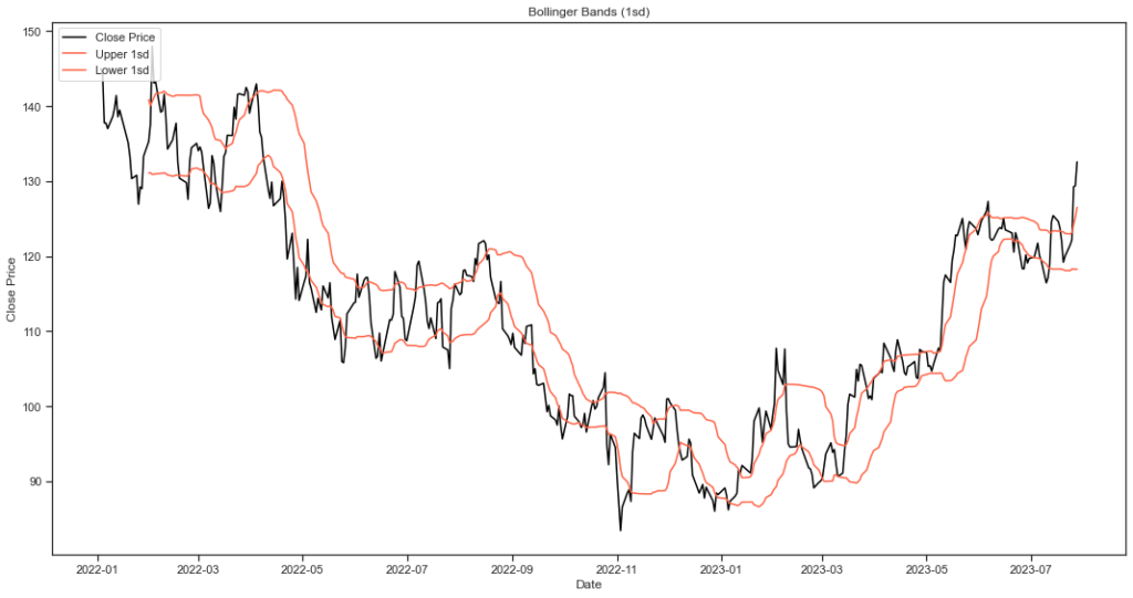
Bollinger Bands was developed by John Bollinger in his book “Bollinger on Bollinger Bands”, and are designed to measure price volatility, and composed of three lines:
- Middle Band: n-period simple moving average
- Upper Band: k-standard deviations above the middle band
- Lower Band: k-standard deviations below the middle band
Here’s how Bollinger Bands can be used in the technical analysis of a stock:
- Volatility Assessment: Bollinger Bands expand and contract based on the stock’s price volatility. When the bands widen, it indicates increased price volatility, and when they contract, it suggests reduced volatility.
- Overbought and Oversold Conditions: When the stock’s price touches or crosses the upper band, it may be overbought, signaling a potential reversal or correction. Conversely, when the price touches or crosses the lower band, it may be oversold, indicating a potential rebound or rally.
- Timeframes: The timeframe used for Bollinger Bands can be adjusted based on the trader’s strategy and time horizon. Shorter timeframes provide more responsive signals, while longer timeframes offer a broader view of price movements.
Here’s a Python example demonstrating how to retrieve the stock price of Google, along with its Bollinger Bands.
# Import Libraries
import pandas as pd
import bt
import talib
import matplotlib.pyplot as plt
import yfinance as yf

############################################
# STEP 1: IMPORTING DATA & DATA FORMATTING
############################################

# Define the ticker symbol for Google (GOOGL)
ticker_symbol = 'GOOGL'

# Create a yfinance ticker object for the specified stock
stock = yf.Ticker(ticker_symbol)

# Fetch historical data for the stock
data = stock.history(start='2022-1-1',end='2023-7-31')

# Reset index
data = data.reset_index()

# Convert to Datetime format
data['Date'] = pd.to_datetime(data['Date'])

############################################
# STEP 2: CALCULATE BOLLINGER BANDS
############################################

# Define the Bollinger Bands with 1-sd
upper_1sd, mid_1sd, lower_1sd = talib.BBANDS(data['Close'],
                                     nbdevup = 1,
                                     nbdevdn = 1,
                                     timeperiod=20)

############################################
# STEP 3: PLOTTING BOLLINGER BANDS
############################################

# Change the size of the chart
plt.figure(figsize=(15, 8))

# Plot the upper and lower Bollinger Bands with 'Date' as the x-axis
plt.plot(data['Date'], data['Close'], color='black', label='Close Price')
plt.plot(data['Date'], upper_1sd, color='tomato', label="Upper 1sd")
plt.plot(data['Date'], lower_1sd, color='tomato', label='Lower 1sd')

# Customize and show the plot
plt.legend(loc='upper left')
plt.title('Bollinger Bands (1sd)')
plt.ylabel('Close Price')
plt.xlabel('Date')
plt.tight_layout()
plt.show()